Nostalgic Conversations: Flatland Kitchen and Rebekah Nolan solo work
Art has a way of blurring the lines between the familiar and the unfamiliar, the distinctions between the artist’s personal experience and that of the onlooker. Two new exhibits at the Harrison Center explore these themes in their own ways. One of these is “You Are Here,” an exhibit of Flatland Kitchen’s Eric and Rebekah Nolan’s collaborative pieces as well as new works by Rebekah. Flatland Kitchen is self-described as a “multi-disciplinary design studio” based in Indianapolis, involved with, in Rebekah words, “branding and identity design, spatial and environmental design,” “signage and public art,” as well as “general design and illustration work such as posters, art prints, and album cover art.” The husband and wife team “believe in slow design and working closely with clients, with a strong emphasis in hand rendering and craftsmanship.” For all of those Sharon van Etten fans out there (like me), you’ll recognize their designs on a number of her album covers. Local examples of Flatland Kitchen’s work are Milktooth’s branding, exterior signage, and interior murals, Amelia’s Bakery branding, and public art such as the log-bench outside Bluebeard.
untitled #29
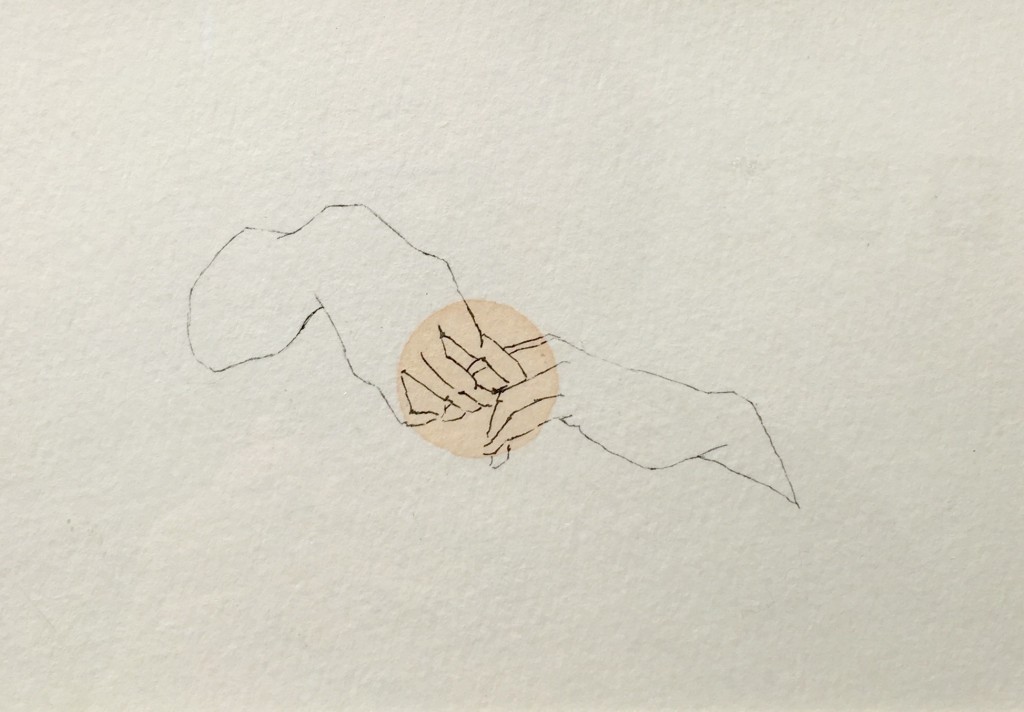
Rebekah’s watercolor paint and ink drawings feature playful interpretations of the everyday: torsos and legs in sweaters and jeans, interlocked hands, fruit, pitchers, and children, dappled here and there with a “warm, dusty pink color.” These subjects are simultaneously snapshots of Rebekah’s every day life and invitations to connect these images to our own experience. Here’s Rebekah’s explanation behind this series:
“At this point in time my work is purely a personal reflection of my current environment. It is simply the means through which I feel I can communicate my perspective with the outside world. I’ve always been an observer and I tend to be drawn to gestural details. For example, the way an individual holds their pen, or the space between the top of someone’s shoulder and the top of their hip and how those contours change when they twist or bend to the side. I enjoy making images that have a weightlessness and familiarity to them. I want it to be an almost nostalgic conversation between the work and onlookers, as if they can plug themselves into the images. Another thing that I feel heavily influenced this body of work is that I did almost all of it with my four-year-old daughter sitting next to me. She would usually draw or paint with me while I took some time to sit and draw every afternoon. Therefore I felt the need to meet small goals with every sitting and to not get stuck on any one thing. I moved through dozens upon dozens of small drawings this way and it was a very freeing and rewarding way to work for a while. However, moving forward I feel the need to slow down again and work with more intent and refinement.” [emphasis added]
So too, Eric and Rebekah’s collaborative work is “a multimedia exhibition utilizing techniques from illustration and sign-making to depict snapshots of our daily lives. In this series of images, we combat the idea of progress for progress’ sake and hope to bring attention to the importance of finding contentment within our lives as they exist today as a result of our circumstances and decisions.”
“You are Here” is a collection of pictorial pauses, highlighting moments and images that might otherwise be lost in the relentless march of life and the pressures that go along with it.
untitled #1


